From the timeless classics, to the bold and creative. Our esteemed experts countdown their favorite beer labels of all time!
Here at Thoughtlab, we like labels. Not the derogatory kind, the kind you find on bottles and cans of beer. Because we also like beer. Someone said to me, you should write a blog about “cool” beer labels. Now, cool is a rather subjective word to me so, I cannot vouch for how cool these labels are however, I find their label design compelling, interesting, unique, eye catching and worth mentioning. If you find them cool… hooray! So here, in no particular order, are 15 labels I like and a bonus one because we all love a little bonus.
Uinta Brewing - Cutthroat
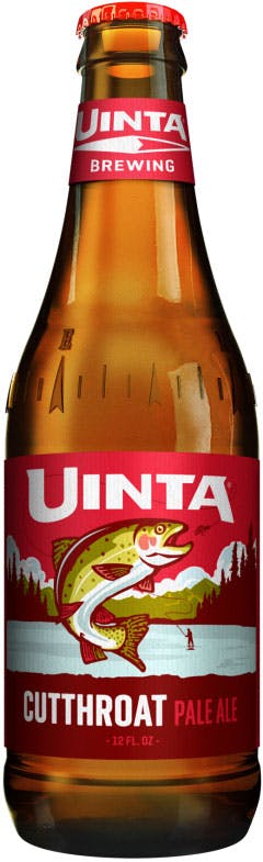
I’ll start local first because we have some great local beers here in Utah with equally great labels. First up, Uinta Brewing. Any of their labels are worth a second look. Great colors and images. They have a bit of an older feeling to them, like a 1940s magazine ad. Lovely images of Utah and Utah related activities as well. I’m fond of the Cutthroat Pale Ale label, it’s a great rendering of a cutthroat trout.
Wasatch Brewery - Polygamy Porter
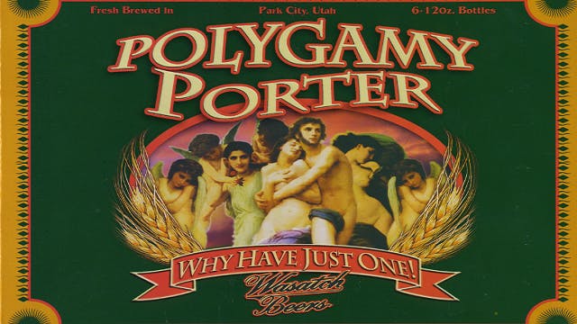
Wasatch Brewery has one of my favorite labels. Their Polygamy Porter is the perfect balance of delightful and offensive. And the tag line; Why Have Just One, pushes the balance toward offensive rather nicely. But what’s so great is the image, it hearkens to the work of the masters like Michelangelo and Raphael, a true work of art.
Fisher Brewing
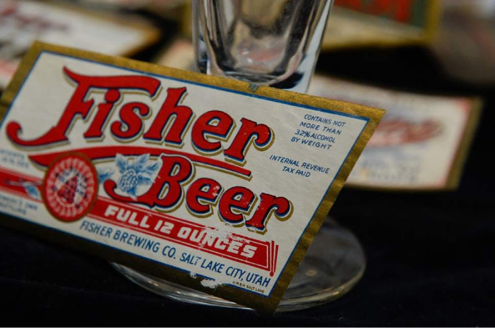
Fisher Brewing company is another local that I like. Again there is a old time feeling to its label with the claim of full 12 ounces, makes you think of classic American products. Sharp font, very simple design but really catches the eyes.
Squatter's - Hell's Keep
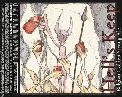
One more local, Squatter’s Hell’s Keep. I love the demons toasting their leader and the overall look of this image. It feels like a homage to the artist Ralph Steadman, who is a favorite of mine.
Harbour Brewing Company - India Pale Ale
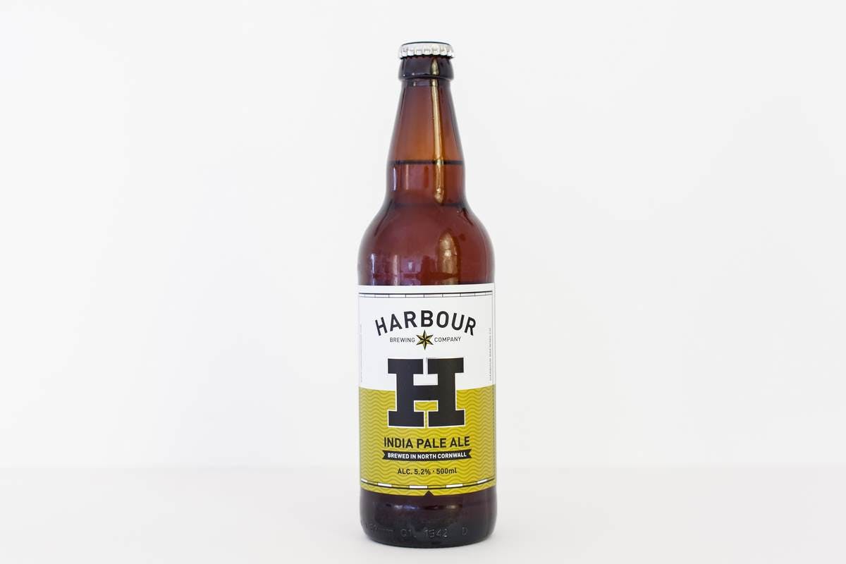
Moving out of Utah I found some really interesting labels. Harbour Brewing Company in North Cornwall, UK has a line of very clean, clear labels. They’re very simple and that simplicity I find appealing. I’ll come back to this theme of simplicity now and then. It’s something I like in design clear lines, clean design.
Burnt City Brewery - Balloon Boy Farmhouse Wheat Ale
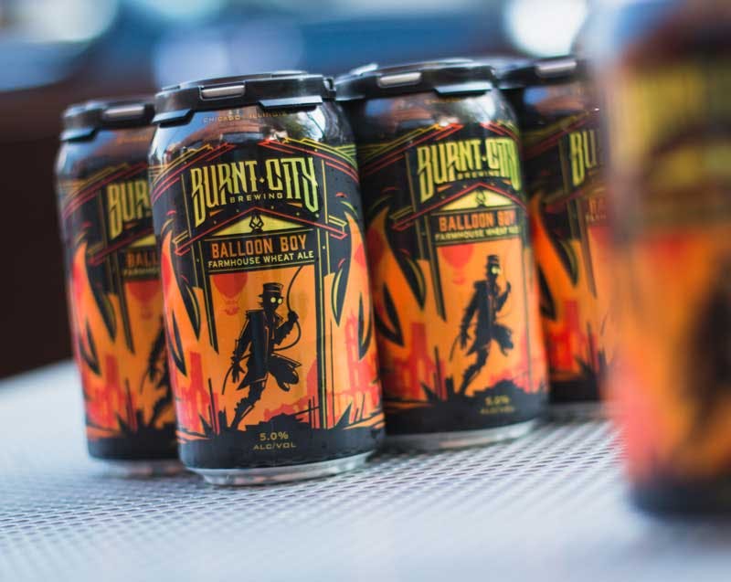
Burnt City Brewery in Chicago has some fine labels going. I am particularly drawn to their Balloon Boy label. This has the look and feel of classic Marvel comic book. Dark, brooding and it hints toward some impending action. It’s a very active label.
Flying Dog Brewery - Gonzo Imperial Porter
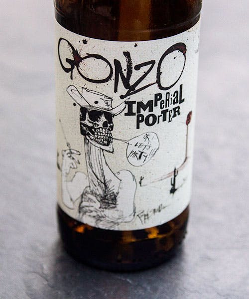
Flying Dog Brewery is one of my all time favorites. I love their labels because they’re all done by the great Ralph Steadman. For those of you who don’t know Steadman was paired with Hunter S. Thompson way back on Hunter’s ground breaking article for Scanlan’s “The Kentucky Derby is Decadent and Depraved.” They continued a very successful partnership after that article with Steadman doing illustrations for Hunter’s famous “Fear and Loathing in Las Vegas”, among others. Fly Dog uses Steadman’s art work on all their labels and they even have a classic image of Hunter on their Gonzo Imperial Porter.
The Russell Brewing Company - Blood Alley Extra Special Bitter
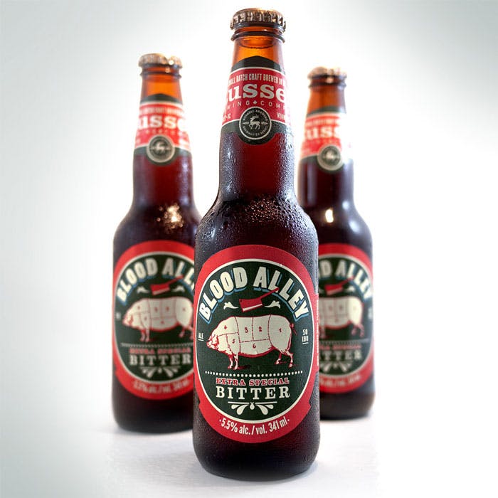
The Russell Brewing Company up in Vancouver has some interesting labels to offer. I like their Blood Alley Extra Special Bitter. This beer is named after the notorious Blood Alley in Vancouver’s Gastown district. The alley may have been named so because of an inordinate number of murders taking place there or it was possibly named after the Blood Alley in NYC that was lined with abattoirs. Blood Alley is a stop on the History of Deviant Alleys Tour in the city. The label for Blood Alley Bitter pays homage to the myths with the butchery image.
Samuel Adams - Infinium Ale
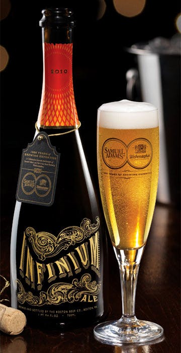
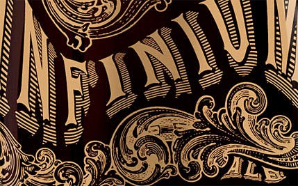
Sam Adams, the brewers in Boston, gave us Infinium Ale. The bottle looks like it belongs in a 1920s bar among champagne and absinthe bottles. It’s classic, intricate and very compelling. It was a highly anticipated beer with Jim Koch, founder and beer-Yoda of Sam Adams saying it was a watershed moment in American beer brewing. It tanked but the label was really intriguing.
Great Lakes Brewing - Elliot Ness Amber Lager
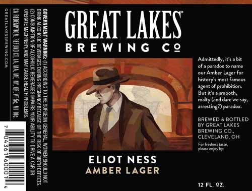
Great Lakes Brewing in Cleveland Ohio is a stand out as far as labels go. All of their labels are little works of art. Darren Booth, a very talented artist, who produces very unique textured works was tapped to bring that style of the labels. Consequently every label on Great Lakes Brewing Company’s beer is a painting. Rich colors, interesting textures and every image tells a story. These are some lovely, artistic labels.
Flossmoor Station Brewing Company - Pullman Brown Ale
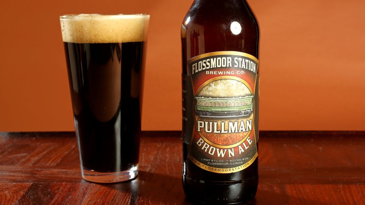
Flossmoor Station Brewing Company’s Pullman Brown Ale has a great label. It’s intricate and yet still highly readable. It has a classic look, hearkening back to days of train travel and possibility, it’s familiar and historical at the same time. The label itself feels like a promise from the brewers that the beer inside will be time tested and of good quality.
Bell's Brewing - The Oracle Double India Pale Ale
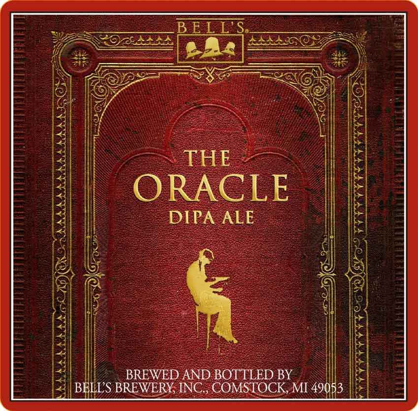
Bell’s Brewing Inc. in Comstock, Mi has so many incredible labels it’s hard to pick just one. Their entire line of labels could take you weeks to study and appreciate. So, if I had to pick one I’d say it’s The Oracle Double India Pale Ale. Once again, I’m pointing out the simplicity of this label but, it’s kind of deceptive. Indeed it seems simple at first glance however, spend a few moments looking at it and it takes you deep. I like this because the image looks like it could inhibit the spine of a very ancient, very special book in some dimly lit, well cared for library.
Deschutes Brewing - The Dissident
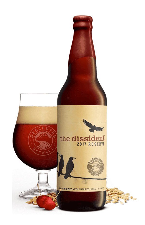
The Dissident, 2017 reserve, is a beer out of Deschutes Brewing in Bend, Oregon. This again shows my attraction to simple labels. The label with the name of the beer and three crows sitting on a wire watching a fourth one fly away, just makes me laugh. It’s sort of like a New Yorker cartoon. It tells a story, a joke or a parable all at once. You can only assume that the crow leaving is the Dissident but it makes you wonder what the official policy of the other crows is that he must escape. I like a beer label that makes me think.
Stillwater Artisanal - A Saison Darkly
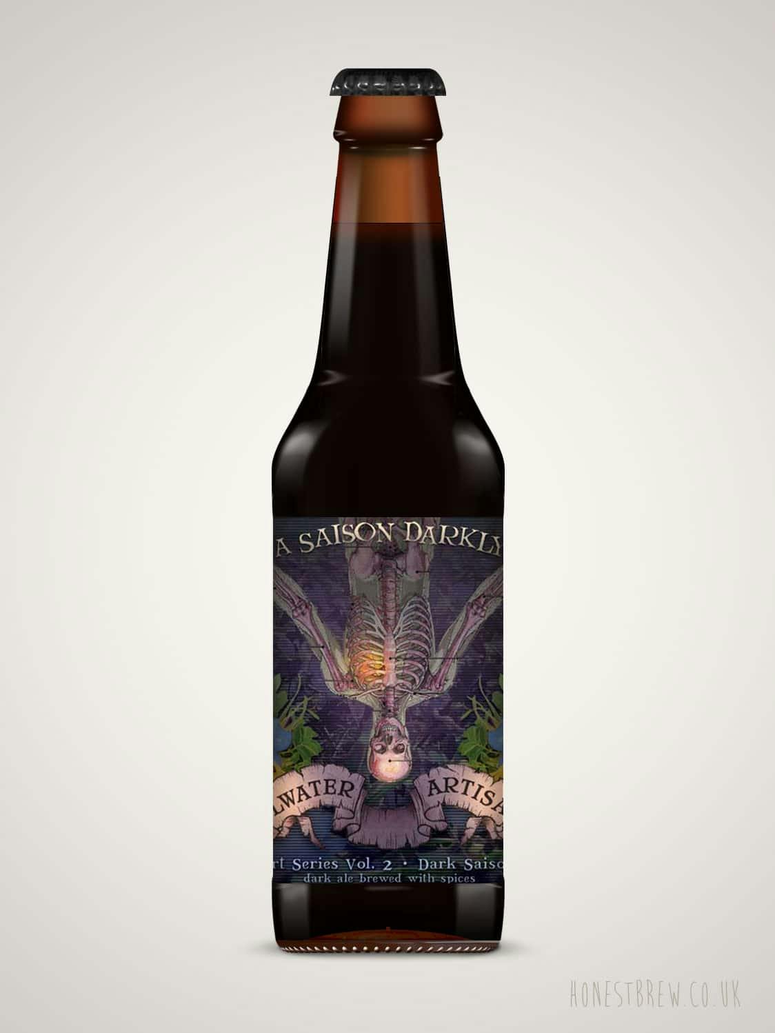
Stillwater Artisanal in Baltimore, MD has a label on their, A Saison Darkly, that is anything but simple and yet, I am drawn to it. Weird, exotic, compelling, slightly creepy. The inverted human skeleton in a translucent skin floating in and among wild flowers and trees is an Edgar Allen Poe novel come to life. Beautiful colors and a stunning composition, this label could be framed and hung on your wall or tattooed onto your body. Still waters uses artists who are inspired by music and all manner of visual arts. They are painters, singers, Dj’s and tattoo artists as well. This is a very lovely label.
Krone - Premium Pilsner
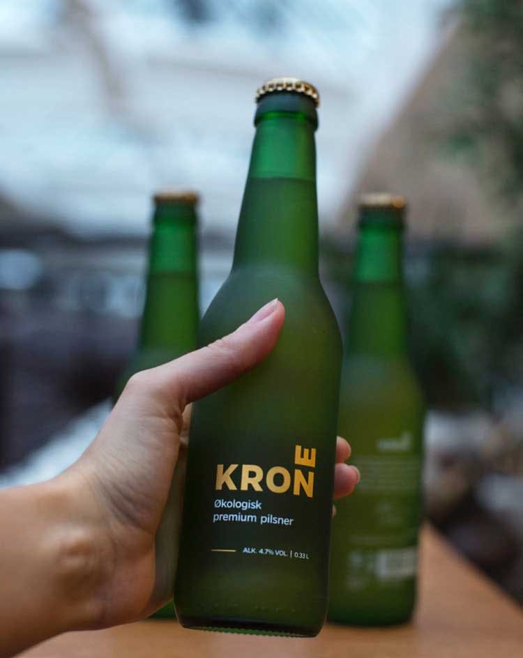
Krone, which means crown, coming out of Norway takes simple to new, wonderful, clean heights. Bottles or cans, this label is just exquisite. The packaging was done by the award winning design company Creuna. A very minimalistic label designed to reflect the few and natural ingredients in the beer. If you Google this you’re going to find out more about the packaging than you will about the beer.
BONUS - General Generic Beer - Beer
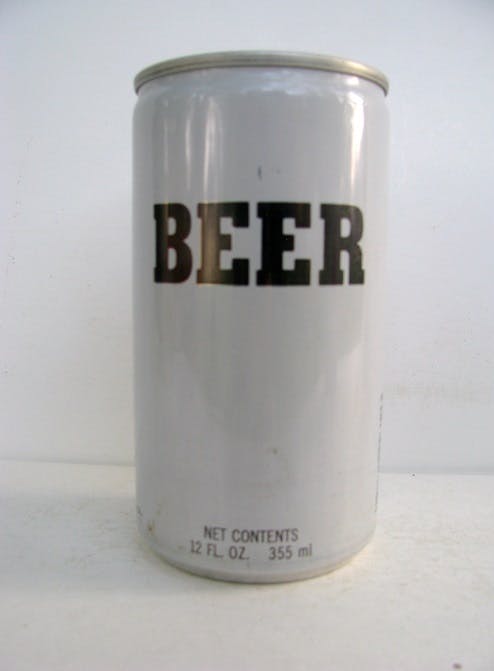
This last one I’m including because it has a personal connection for me. It is Beer. Also known as General Generic Beer. This is the simple, white label with the word BEER written in black letters. It was originally produced by Miller Brewing Company and sold as a Pilsner-style beer. It was incredibly cheap, I recall buying a six pack for $1.65, which is my personal connection, drinking this stuff as a teenager because it was cheap. The label is transparency defined. Hey, you want a beer, here’s a BEER. Miller eventually retired if because, well, it tasted like cat pee.
Okay, that’s it, 15 beer labels, plus one, that I really liked. I hope you enjoyed them and maybe you’ll take a look at them as well. Here’s a better idea, drop us a line with your favorite beer label or labels and tell us why they are so cool. We’re always happy to hear from you.