

Exploring the journey that potential leads take when they come in contact with your site, that turns them into successful conversions.
In our previous two installments on Conversion Rate Optimization we discussed Conversion Hurdles and Best Practices for High Converting Websites. We’ve reviewed a lot of general tips on how you can increase and improve conversions for your site. Now we want to start exploring the journey that a potential lead might take when they come in contact with your website, and what turns that lead into a successful conversion - enter the conversion funnel.
What is a Conversion Funnel
You don’t have to sell goods and services to have a conversion funnel. You can create one for any type of conversion goal or “action” that you are wanting users to take. So what exactly are the elements of a conversion funnel?
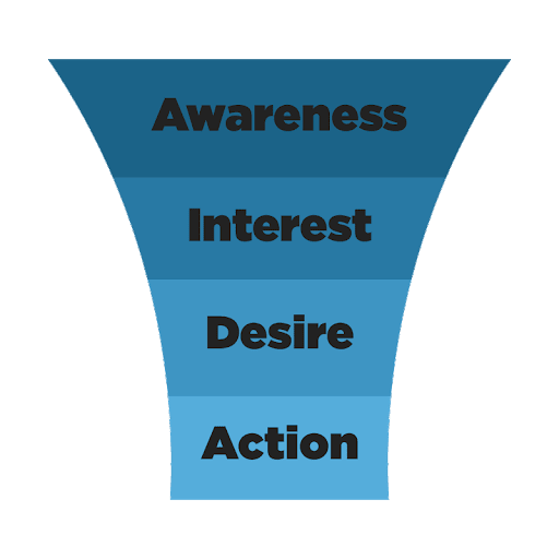
Awareness
The top of the funnel is all about generating awareness and getting people to enter into your funnel. You need to make people aware of your brand and get it in front of new audiences.
There are a lot of different ways to go about lead generation, whether you decide to go the PPC route, create buzz through social media, or simply draw in traffic through organic sources. Whatever route you choose to go, you will want to analyze your traffic data to make sure the leads you are bringing in are actually qualified. If you don’t have the right type of audience coming in, they won’t enter your funnel and of course, they won’t convert.
Interest
Once you’ve managed to create some awareness and bring people in, it’s time to get them interested in what you actually have to offer. This is where your landing page and content play a big role. Having content on the page that engages your audience and keeps them interested so they keep reading. You’ll want to list benefits and the value you have to offer, as well as what sets you apart from your competition. This helps to build trust with your audience.
At this stage you will want to try capture to their emails. You can do this by enticing them with something like a discount code, newsletter, ebook download, etc. Once you’ve obtained their email, you can better nurture them into a conversion.
Desire
This is the stage where you want to make your leads even more interested in what you have to offer and demonstrate exactly why they need to go with your company versus a competitor. This is the easiest to accomplish once you’ve obtained an email and launch a drip campaign. We’ll look at email campaigns in a bit more detail later.
Action
This is the end goal of any funnel, getting your lead to convert. They may have made some micro-conversions before in the interest phase by giving you their email for example, but the real conversion is getting them to make a purchase. You won’t get all of your leads up to this point, but as you start to learn what sort of triggers they best respond to, you can continually improve your funnel.
Now that we’ve covered the basics of a conversion funnel, we can start to look more in depth at how you can implement some of these stages, and different tactics you can use.
Landing Pages
We actually wrote a whole article about the anatomy of high converting landing pages, which you should check out if you have the time. If you don’t have time, don’t worry! We will still touch on the main points here.
Have one goal
Before you even get into developing your conversion funnel, you have to decide what you want your end goal to be. Do you want people to sign up for your newsletter? Download a free trial of your service? Or, of course the obvious, make a purchase. Whatever your end goal is, you need to make that singular goal the theme of your landing page.
Take Progressive for example. When you search for “car insurance”, this is the landing page that you receive:
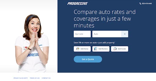
There are no distractions or clutter on this page. Their goal is clear, fill out the form to get a quote. You can’t clearly navigate off of this page apart from hitting the back button. They have a few links on the bottom, but it’s there for legal reasons or you have the option to contact them.
The more distractions you have on the page, the less likely someone is to convert. Distractions can range from videos, links, to providing too much information. These are all things that can cause the user to leave the page without first completing your goal. You may not be able to have as simple of a landing page as the one above, but try to remember the rule of one, by having one goal, once CTA, and one main point of focus.
This is the best representation of the interest phase as they tease you with how easy and quick it is to get a quote. Once you actually get the quote, they would have the opportunity to tap more into the desire phase by being competitive with other insurance companies.
Using colors or white space
There have been many articles published about the psychology of colors and how to use them. We won’t get into all of the details here, but essentially all you need to know if that different colors set different moods.
When it comes to deciding a color scheme, you’ll want to follow the 60:30:10 rule. Pick three colors; one for the background (60%), one for the base (30%), and one for accents (10%).
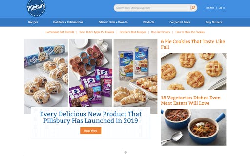
Take this snippet from Pilsbury for example. We can see that their background color is white, base color is blue, and the accents are orange. This is a nearly perfect example of the 60:30:10 rule, although it does shy away from the “rule of one” that we talked about previously.
You can consult the color wheel to help you decide which colors to use for your website. Try to pick one that aligns with the mood and tone you want to set for your brand. Here are the very basics when it comes to the moods that different colors set:
- Red: This color most often represents power, love, horror, or strength.
- Orange: This color is generally used to create a feeling of warmth, comfort, motivation and positive attitude.
- Yellow: Often used to increase confidence, provide inspiration or lift the spirit.
- Green: Most people think of money when they see green. However, it can also be used to relieve stress, rest and good health.
- Blue: This is a very cool color and often triggers a mental reaction for people to destress and have a sense of calmness about them. Used a lot for building trust in relationships.
- Purple: Most frequently associated with this color is creativity and mystery and wonder.
- Black: This color is used to display seriousness, independence, and sophistication.
- White: Displays innocence, cleanliness, purity and peace.
Of course there are more colors than those above, and you should research each color to determine what mood you want to set, and how to combine the colors to get the best result.
While we are on the subject of color schemes, you also don’t want to forget about white space. Incorporating white space into your landing page is a great way to make it feel less cluttered and more readable. You may also have noticed that whenever something is enclosed in white space, your eyes are naturally drawn to it.
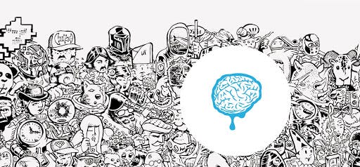
In the example above, you can see that your eyes can’t help but gravitate towards the brain within the white space. You can use tactics like this, and others, to manipulate where you want your user’s focus to go.
Proper use of images
In a previous section we discussed evoking emotion. This is also a tactic that can be used through images. Images can be powerful when it comes to impacting someone’s mood or directing their gaze. The best example that I’ve seen comes from ASPCA. Even if you are not familiar with their commercials, you can understand the mood and tone they are trying to set with the images that they’ve selected to use throughout their site.
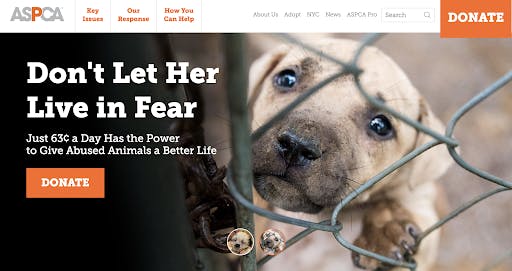
They implement quite a few of the tactics we’ve discussed by having a strong value proposition, tapping on the desire phase by highlighting that with only 63 cents a day you can save abused animals, which also taps into the guilt emotion to try to persuade you to act, AND they have a clear call to action that really pops with a contrasting color. Overall this landing page is hitting all the right notes.
With use of the right imagery, you can get someone to feel the emotions that you want tied with the product or service you are selling. You can also use images to help manipulate someone’s gaze, similar to the white space.
Having someone point or gesture toward an important element on the page gets users to focus on that area. Similarly this can be accomplished by having someone look towards the important element as well. These are subtle yet effective directional cues.
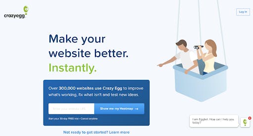
You can see this tactic in use by Crazy Egg, where they have the illustration pointing towards the form space.
Creating a sense of urgency
limited quantity, or limited space, this will cause any rational thinking a user might have to go out the window. This often taps into two of the emotions that we talked about before; fear and greed. Fear for the obvious reasons of missing out, and greed depending on what the offer is. This is also most applicable to the desire and action phase.
If you’ve got a user warmed up to your brand through the awareness phase, and you’ve generated some interest in what you’re selling, then creating a limited time BOGO offer may definitely cause them to have more desire and act quickly.
The one rule to follow here is to be genuine. If you say an offer is only available for a limited time, make sure to stick to that time.
If a user comes back to your site after that time has passed, sees the offer still available, well the sense of urgency is now gone. There is no reason to act quickly when they know they can come back at any time for the same deal.
Of course at the end of the day all of the items we’ve discussed thus far can be applicable to your landing page. As always, test to see what works.
Micro Conversions
We talked all about the interest phase and how it’s important to capture a user’s email to better nurture them into a successful conversion. But what is the best way to get a user to willingly provide their email?
If you are new to the marketing world, you might not be aware of the terms macro conversions and micro conversions. Essentially a macro conversion is the main goal you want someone to accomplish. For most businesses this would be a purchase or maybe an application for something like a loan. However, not a lot of user’s convert on the first run. Part of the buying cycle is getting users to make smaller commitments known as micro conversions.
Micro conversions can be anything from viewing a certain amount of pages on your site, to playing a video or sharing about you on social media. We are going to focus on the more email centric micro conversions today.
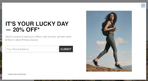
Email opt-in popups
One of the most common strategies that website owners use to capture a user’s email is the popup. You have to be wary about the timing of your popup, as well as the content within because some users may find them to be irritating and leave.
There a few main strategies when it comes to popups:
Exit Intent Popups: These popups sneak up on you right as you are about to leave a website. It’s usually a last ditch effort to get your business and generally offers some kind of promotion or incentive.
Delayed Popups: These are the ones that show up after you’ve met a certain criteria such as spent a set amount of time on the site, or viewed a certain number of pages. You may reach a smaller audience with this one, but the audience you do reach are already more qualified.
Top Bar: This one is always visible to the user, yet never obstructing their view in an annoying way.
Welcome Gates: These are the ones that completely overtake your screen after you’ve been on the website for a few seconds. Some websites can be quite aggressive with this tactic by making it unclear how to close out of the popup, so it can be annoying and even frustrating to try and navigate back to the site. You don’t need to be overly aggressive with this one, make sure there is a clear way on how to close out of the popup to create a better user experience.
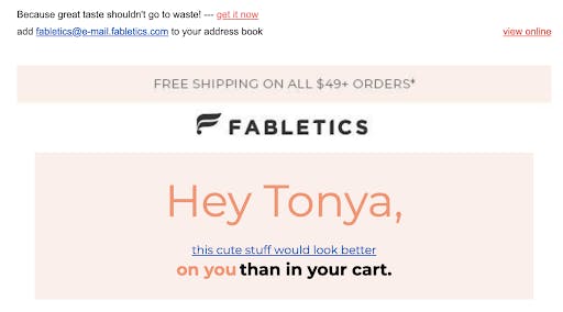
Offer a promotion to a new subscriber
Of course the easiest way to get an email is to tap into the greed emotion. Who doesn’t love getting 45% off their first order or unlocking a 30 day free trial?
You might think this tactic is more action phase oriented because the coupon or discount would give them a reason to convert. If your goal is to make a one time conversion, then sure. But we want to create loyal customers who turn into repeat buyers. This better demonstrates the desire phase, as we are giving them a reason to pick you over the competition and if you provide a free trial then they actually get to test the product to see if it’s right for them.
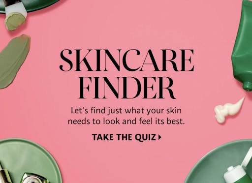
Try a quiz
Quizzes can be a great way to engage someone during the interest phase. Often times in order to see their results, they are required to enter an email. It’s an easy way to get information in front of a potential buyer in a fun and interactive way.
Host a webinar
If you’re in the type of niche where this is applicable, hosting a free webinar can be an excellent method for capturing emails. Just make sure that you pick a topic that your audience is interested in and plan out the content and script.
There are many more ways to go about gathering emails, these are just a few of our favorites. As always, test out some different options to see what works for you and the industry you are in.
Launching an Email Drip Campaign
Once you’ve gathered your email list, you can enter them into what’s called an email drip campaign. This is an automated marketing strategy composed of multiple pre-written emails that are sent out at specific dates and times. All of the emails work together to lead a consumer towards your final conversion goal.
Drip campaigns are a great way to educate, reward and build trust with customers, all within the same campaign. Instead of sending out generic emails to your entire campaign list, you can place subscribers into different funnels and give a unique, relevant, and more importantly - personal, approach to each. By having the emails feel more personal and targeted, this leads to less unsubscribes and a higher conversion rate.
Drip campaigns generally consist of the following:
Welcome emails
This is the first email a subscriber gets in your campaign. It’s the introduction, the first impression, the chance for you to show that you’re not just trying to get a sale out of them, but rather get to know them.
The means of how your user subscribed will determine the type of messaging that will be contained in the first email. This can be anything from a simple “Thanks for subscribing” to providing coupons or sharing useful content.
Onboarding emails
These are the emails that will help turn your free trial leads into paying customers. All they need is a little nurturing and further education on your product and how you differ from your competitors. You can highlight features of your product, case studies, how you’ll solve any pain points they may have, etc.
Abandoned cart emails
The percentage of people who abandon their carts range anywhere from 50 - 80%. By incorporating an abandoned cart email into your drip campaign, you can re-engage those users and convince them to come back.
You can do anything from reminding them what was in their cart, hit on some additional value propositions, or even give a discount code.
Confirmation emails
If you’ve managed to make a conversion, send a “thank you” email to confirm their order, subscription, account creation, etc. Also provide detailed information about the next steps moving forward. You will want to continue to keep your audience engaged by encouraging they share their recent purchase on social media, or you can even offer something like a discount on their next order if they review your product.
Re-engagement emails
If you find that some of your subscribers have gone ‘stale’ and are no longer clicking on your emails, you can attempt to re-engage them. You’ll want to focus on creating a really compelling subject line so they’ll be more likely to open the email.
Final Thoughts
Overall when it comes to creating a drip campaign you have to consider the journey you want your customer to take. Take time to understand where they are at in your conversion funnel and provide relevant content to help guide them through the different phases.
Awareness Phase: This type of content is focused on proving helpful information that’s relevant to the needs of your audience. This can range anywhere from blog posts, articles, a guide or tutorial, newsletters and more. Don’t focus on making a sale in this stage, the primary focus should be education.
Desire and Interest Phase: This is where you will want to highlight customer testimonials, case studies, offer free trials or samples, or address frequently asked questions. You can start to be more sales focused in this content and highlight what makes you better than the competition.
Action Phase: This is the most sales focused copy as you want your subscribers to now take action. This is where you would offer a discount code, free consultation, pricing information, etc.
Creating a conversion funnel and putting it in place can definitely feel like a daunting task, but once you better understand your audience, their wants, needs, and pain points, you can adjust your funnel to convert more website visitors into long-term customers.