We're dissecting the anatomy of what makes a good “post-click landing page” so that you can get users into your marketing funnel with ease.
When it comes to designing a landing page, you have to consider what the end goal is. Are you trying to get users to provide you with their email? Maybe you want someone to sign up for your webinar or actually purchase a product from you. Determining what your goal is will help you to figure out what type of landing page to design. There are several different types of landing pages that range from:
- Squeeze page
- Splash Page
- Lead Capture Page
- Click-through Page
- Long-form Sales Page
- Pricing Page
We won’t be going into detail about all of these pages as we know your time is valuable. Today we want to dissect the anatomy of what makes a good “post-click landing page”. This is as the name describes, a landing page that people are directed to after they click on an ad. After all, the first step to having a user complete your end goal is to get them entered into your marketing funnel, so you can nurture them into a lead. So with that in mind, grab your scalpel and let’s start dissecting.
Have One Goal - and Stick To It
When it comes to post-click landing pages, you want to have one singular goal in mind and make that singular goal the theme of the page. If your goal is to have users download your ebook, you need to guide visitors towards that action without letting distractions get in the way.
So for example, when we searched “Learn French” on Google and clicked one of the ads for Babbel.com, this is the landing page we received:
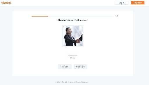
This is the entirety of their landing page. No distractions. No clutter. Their goal is to get you to interact with their website and test out their language learning program. Once you’ve gotten a feel for it, you’ll want more. You can notice that the “Register” button is in bright orange and very prominent. Once you finish going through the first 5 lessons you are immediately directed into the registration process.
Here is an example of another landing page we received for a different website using that same search query:
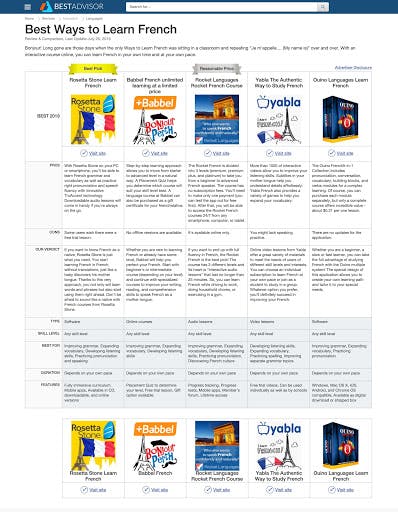
There is no clear CTA or goal with this page. We can assume that they do affiliate marketing and that their goal is to get you to convert by buying one of these products. There are a lot of distractions on this page, it feels cluttered and they are not directly guiding a user to the action they want completed.
Distractions can come in many forms, from links, videos, to providing too much information. Depending on the goal of your landing page, you may not be able to have something as simple and straightforward as Babbel. It’s important that you still try to follow the rule of one, by having one goal, one CTA, and one point of focus. If you follow that rule, you’ll have a better converting landing page.
Utilize Colors and White Space
There is a lot of psychology when it comes to colors and how to use them. TL;DR different colors set different moods. We won’t get into the color wheel too deep, as that’s an entirely lengthy subject on its own. The basics, however, come down to using the 60:30:10 rule. Pick three colors with one being the background, one being the base, and one being your accent color.
The background will take up the majority of the space (60%) and will be the most prevalent color. This should be a color that is easy on the eyes, so steer clear of the bright and bold.
The base will utilize 30% of your visual space and should be a color that is complementary to your background. This generally is the space that fills a header and footer, and a form if you have one.
Finally, the accent color (10%) will be anything you want to stand out, like a CTA button. This should definitely be a bold color that is contrasting the rest of your scheme, so it really stands out and calls attention to itself.
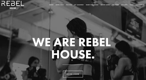
Below is an example of a landing page we received when we searched for a gym. Nothing really stands out here, as they stuck to a monochrome color scheme. They managed to use white space to make their header stand out more, but their call to action button gets lost in the background.
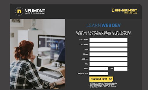
Here is a better example from Neumont, that is also a mostly monochrome theme, however, they added bright yellow to really draw attention to their CTA button and phone number.
While we are on the subject of color schemes, you don’t want to forget about making use of your white space. It’s a great way to make a page feel less cluttered. As humans, our eyes naturally gravitate towards areas within white space, so you want to use your white space appropriately to manipulate where a user’s focus goes.
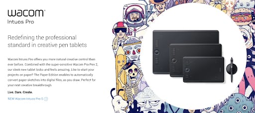
Wacom wants you to focus on their tablet, shown above. As you can see, your eyes can’t help but gravitate towards it.
Use Images Properly
Believe it or not, but there is a strategy when it comes to images. Images can be a powerful way to impact someone’s mood or direct their gaze. The best example we can think of is ASPCA. You are probably familiar with their commercials, as they immediately cause you to want to change the channel before you burst into tears. The good news is that you don’t need Sarah Mclachlan playing in the background to evoke that same kind of emotion.
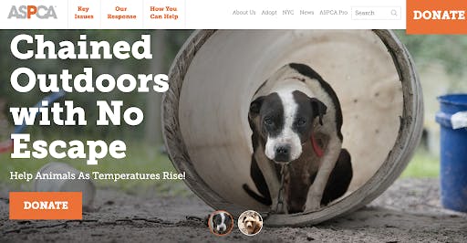
ASPCA can still get you to feel that same emotion with just an image. Emotions are a very powerful thing and can cause someone to act without thinking or make irrational decisions. By tapping into these emotions, you can directly impact how someone feels and direct them to the action you want them to take.
People buy things for two main reasons:
- For pleasure
- To avoid pain
Thinking about a dog chained up in the heat of summer with no shade is very painful. To avoid this pain you can donate money to help the ASPCA, and lift that emotional burden from your shoulders by doing something good.
Emotion isn’t the only way an image can manipulate you. Another common practice is when an image is used to direct your gaze.
Take this one for example:
What is she looking at? You subconsciously want to find out, and can’t help but look to where she is looking.
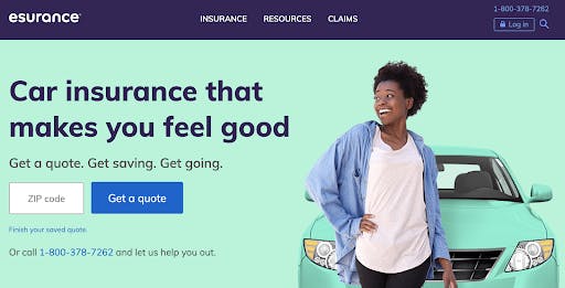
Here is another example:
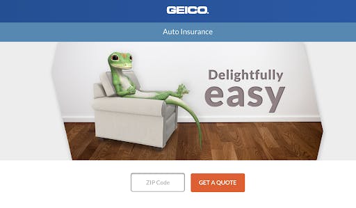
What sort of directional cues can you pick up from this image?
If you noticed the gecko’s tail is pointing directly at “get a quote” you’d be right on the money. It’s subtle but effective.
Create A Sense of Urgency
While we are on the subject of influence, we should talk about urgency. When you create a sense of urgency, whether by making something available for only a limited time, limited quantity, or limited space, this will immediately cause rational thinking to go out the window.
It’s instinctive to want something that you can’t have. So when you make your item scarce, it’s now more desirable.
The caveat here is that you need to be genuine. Don’t say an item is 50% off for today only when you’ve been saying that all week.
We decided to revisit our earlier “learn french” query to see if we could find any good deals.
This is the sale that Udemy was running yesterday. We wanted to make sure they were being genuine in their claim, so we checked back on them a few days later.
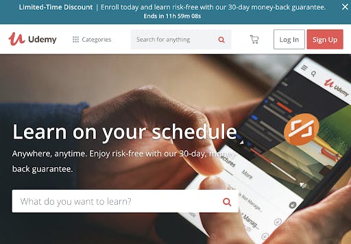
What did we find?
They were, in fact, running the same sale, the countdown timer reset.
The sense of urgency is now gone. Why do we need to act on this so quickly when we can just come back later and be greeted by the same offer?
Once a user has caught you lying, you immediately break trust with them and cause them to get a bad taste in their mouth about your brand. After all, if they can lie about this, who knows what else they might be lying about.
When In Doubt, Go Back to The Basics
Landing pages don’t have to be complicated, especially with all of the drag-and-drop templates that have been popping up as of late. If you don’t feel confident in being able to incorporate the above items, there are a few basic elements that every type of landing page should have.
Unique Value Proposition - As much as Udemy lied to us, they still had a good value proposition, “Learn on your schedule”. A lot of people are busy and don’t have time to commit to learning something new, especially not a language. They are wise to highlight that with their program you can do it whenever you have time.
Readable Copy - When writing copy, make it easy to understand. Include the benefits and features of what you’re offering. If your copy is long, break it up with bullet points, lists or short paragraphs.
Trust Signals - They come in many forms ranging from customer testimonials to showing reputable brands that you’ve worked with. Make sure that you sprinkle various trust signals throughout your page to start building a good relationship with your user.
Short Forms - If you require information from a user, keep it short and simple by asking for only basic information. If there is a reason you would need to have a lengthy form, you can keep your user's attention by making it a multi-step interactive form.
CTAs - Our final piece of advice is to have a good CTA. You want something that is clear, shows value, and if possible, creates a sense of urgency. When thinking about your call to action, try to think of it more as a call to value. “Book now” and “Learn more” don’t entice a user as much as “start losing weight” or “achieve fluency”. Don’t be afraid to get creative.
We would also like to remind you that testing is inevitable. Don’t just throw a landing page together and call it a day. Test it, see what kind of response you get, make some tweaks and test again. If you have any questions, feel free to drop us a line!