
As a website designer, understanding color theory and how to use it effectively can significantly enhance your designs and create a better user experience.
Color is a powerful tool in website design. It can evoke emotions, create moods, and influence user behavior. As a website designer, understanding color theory and how to use it effectively can significantly enhance your designs and create a better user experience.
Color Theory 101
Before diving into how to use color in website design, it's essential to understand the basics of color theory. Colors can be broken down into three primary colors: red, blue, and yellow. Mixing two primary colors creates a secondary color, such as orange (red and yellow) or purple (blue and red). Tertiary colors are created by mixing a primary color with a secondary color.
Color theory also includes the concepts of hue, saturation, and brightness. Hue refers to the specific color, such as blue or green. Saturation refers to the intensity of the color, with high saturation being more vivid and low saturation being more muted. Brightness, also known as value or lightness, refers to how light or dark the color is.
Understanding color theory is important because it can help you choose colors that complement each other and create a harmonious design. There are several color schemes you can use in website design, including complementary, analogous, and monochromatic.
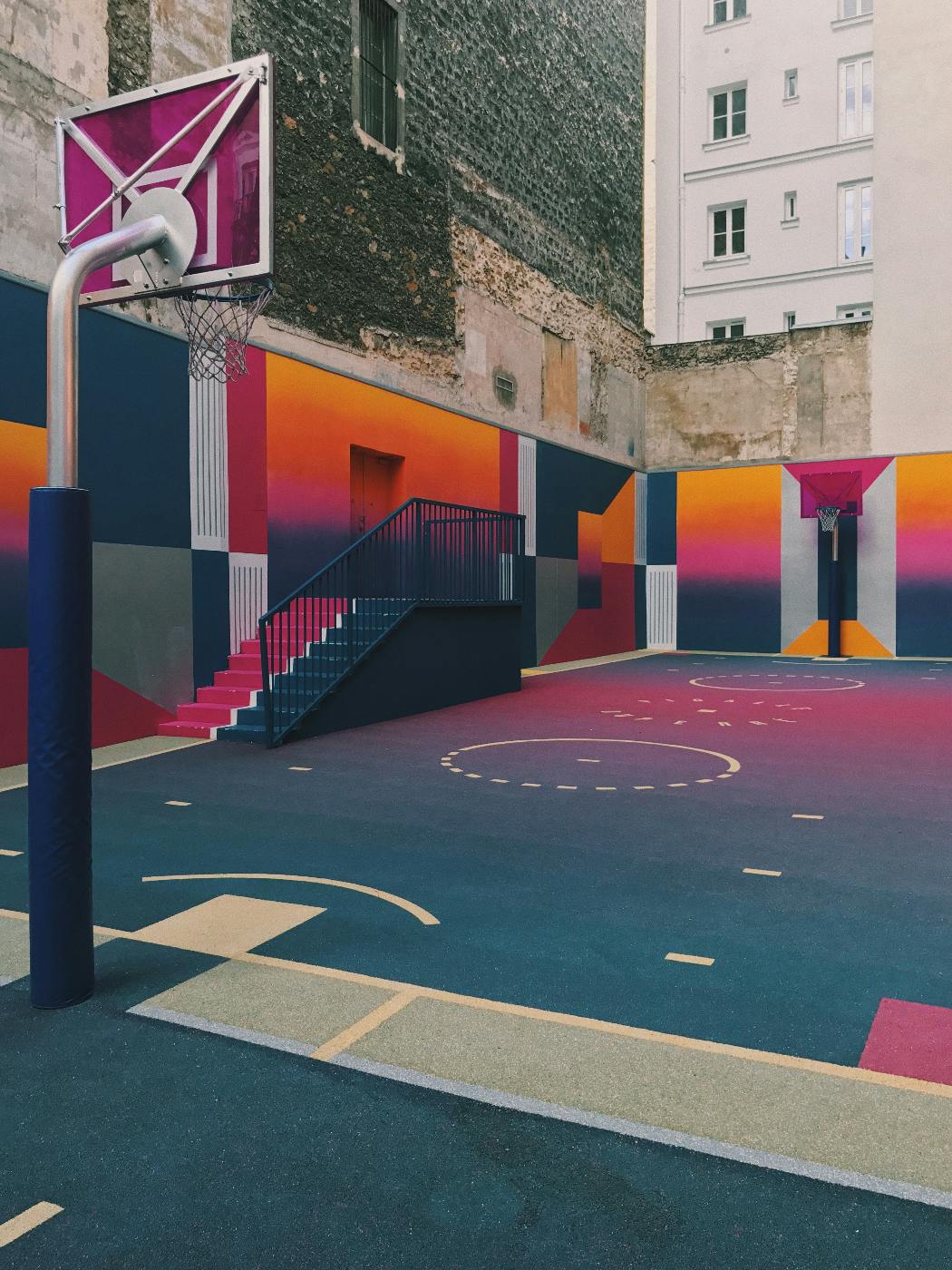
Complementary colors are opposite each other on the color wheel, such as blue and orange or red and green. Using complementary colors can create a bold and eye-catching design. Analogous colors, such as blue, blue-green, and green, are next to each other on the color wheel. Using analogous colors can create a more subtle and cohesive design. Monochromatic colors are variations of a single color, such as light blue, medium blue, and dark blue. Using monochromatic colors can create a calming and harmonious design.
Using Color to Evoke Emotions
Color can have a significant impact on how users feel when they visit your website. For example, blue is often associated with calmness, trustworthiness, and professionalism, which makes it a popular choice for corporate websites.
Green is commonly linked to nature, growth, and health, making it suitable for eco-friendly or wellness-related websites.
Red is often used for urgent or attention-grabbing messages because it evokes a sense of excitement, urgency, and passion.
Yellow is associated with happiness, optimism, and energy, making it a good choice for websites related to creativity, entertainment, or leisure activities.
However, it's important to keep in mind that cultural and personal associations with colors can vary, so it's always a good idea to test and refine your color choices based on your target audience's preferences and the emotions you want to convey.
Color & Branding

Color is an essential element in branding, and its importance cannot be overstated. It has the power to communicate a brand's personality, values, and message in a way that words cannot. Color is a universal language that can evoke emotions, memories, and associations, making it a valuable tool in creating a brand identity that resonates with consumers.
Color psychology is a field of study that examines how colors affect human behavior and emotions. It has been shown that colors can influence mood, perception, and behavior, making them an essential consideration in branding. Brands can use color to create a particular emotional response in their customers, such as trust, loyalty, or excitement.
One example of the power of color in branding is the iconic red and white Coca-Cola logo. The bright red color represents passion, energy, and excitement, while the white background suggests purity and simplicity. These colors together create a sense of excitement and fun, which is perfect for a drink that is associated with parties, celebrations, and happiness.
Another example of the effective use of color in branding is the green and white Starbucks logo. Green is often associated with nature, growth, and health, which are values that align with the company's focus on sustainability and ethical sourcing. The white background adds a sense of purity and simplicity, which is in line with the brand's commitment to transparency and quality.
Color can also be used to differentiate brands from their competitors. In a crowded market, brands need to stand out and be memorable. Choosing a unique and recognizable color scheme can help a brand to be easily identified and remembered. For example, the bright orange color used by the mobile network provider Orange is instantly recognizable and distinguishes the brand from its competitors.
Color can also be used to convey a brand's message or values. For example, the blue and yellow color scheme used by Ikea suggests a sense of fun and playfulness. At the same time, the clean and modern lines of their furniture indicate simplicity and practicality. In contrast, the red and white color combination used by Coca-Cola conveys excitement and energy. At the same time, the distinctive shade of green associated with Starbucks communicates a sense of nature, freshness, and sustainability. The careful selection and use of colors can help a brand to create a unique identity and strengthen its communication with its target audience. Additionally, colors can also evoke certain emotions and associations, which can influence consumer behavior and purchasing decisions.
Summing Up
Color is a fundamental element of website design that can influence how users perceive and interact with a website. The use of color in website design can evoke emotions, convey meaning, create a visual hierarchy, and enhance user experience. The right combination of colors can help to communicate the brand personality, guide users through the website, and encourage them to take specific actions.
On the other hand, poor color choices can create confusion, distract users from important content, and negatively impact the website's overall usability. Therefore, it's essential to consider the psychological and cultural associations of different colors when designing a website.
Having color and design issues, that’s okay; it’s not easy to get this stuff right. You should call a full-service creative agency that has decades of experience with design and colors. Talk to the experts at ThoughtLab, and they’ll color you happy.