

Are your leads suffering from form fatigue? Use these tips to simplify your forms and increase your conversion rate.
Form Fatigue
We here at ThoughtLab have given a fair bit of advice when it comes to your website, or more specifically, your landing pages. Today we want to touch on the subject of form fatigue. What is form fatigue? Essentially it’s when a user gets bored, tired, or loses patience and leaves a form half-filled, never to return.
Don’t let your users fall victim to this plague, provide them with a form they’ll use.
There are many reasons for a website to have a form, and not all of these suggestions will apply to each type of situation. Our hope is that you can take some of the advice we have to give and apply to whichever type of form you are creating.
Keep It Simple
First, we will consider the overall design of the form, how it’s structured. You don’t want to have an overly long form that requires endless scrolling from a user, asking for all types of various information, such as their dog’s birthday. We want to keep things simple. The simpler the form, the faster a user can fill it out, and the less chance they have of catching form fatigue.
ways to simplify your form
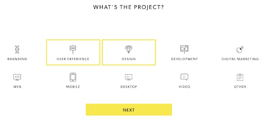
Multi-step forms
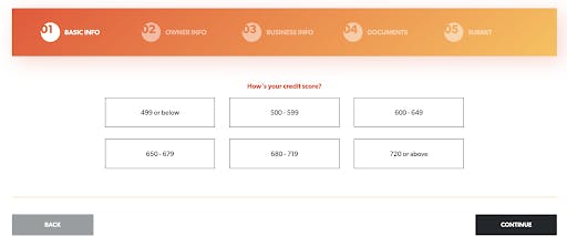
The best way to keep a user engaged is by having the form be interactive with multiple steps. They don’t feel overwhelmed when they see a simple and short form, and they can navigate through the various steps with ease. If you require a lot of information from a user, be sure to include a progress bar so they can be aware of how many steps remain. You don’t want to keep a user in the dark and make them feel as if this multi-step process is never-ending.
Asking too much
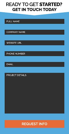
We understand that sometimes a lot of information is necessary. We also know that sometimes it’s not. Try to find ways to cut down on the information you’re asking for, to make the form shorter and easier to fill out. Take the below image for example. This retirement home directory asks only for you name, email and phone number. Simplicity at it's finest.

Vertical fields
When fields are stacked vertically, they are easier for users to digest than horizontal ones. This makes the form a breeze to fill out.
Auto-fill
This is a great way to streamline the form completion process. Enabling auto-fill on your form will allow it to utilize common responses that a user has previously provided on the site or within the browser, such as shipping or billing information.
Inline field labels
Having the labels inside the fields makes the form sleeker and does away with any doubt as to which field is for what label. This makes it easier to use and gets your user through the form quicker.
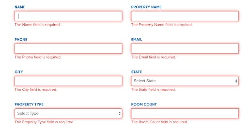
Error message
This will help a user to quickly see a field they may have missed or filled out incorrectly. You should also clearly label which fields are required, and which are optional.
Mobile-friendly
Everything about your site should be mobile-friendly. Especially your form. You don’t want a user to have to scroll vertically through the form to fill out fields that are off-screen. Make sure your form is optimized for mobile users.
Add Options
If you need to know what days someone is available, or what services they are interested in, make a choice field with either checkboxes or radio buttons that a user can select, rather than having them type everything out.
Overall design
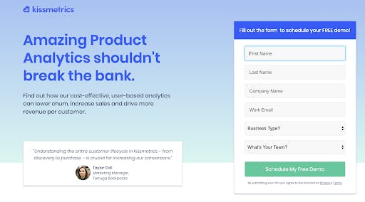
People are more likely to use and trust a form that has an aesthetically pleasing design. Make sure you take the visual appeal into consideration when designing your form. Don’t do just a drab and plain form with various boxes to fill out. Take the email subscription form by All Language Resources for example. They have an appealing graphic, nice color choices, and fun use of fonts.

Contrast CTA's
You really want to make your CTA stand out. There have been various studies based on how changing the color of your CTA can increase conversion rates, however, this can be misleading. It’s not a matter of simply changing the color, it’s a matter of picking a color that is contrasting to the rest of the site.

Interesting CTA’s
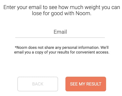
Instead of the simple “submit” try playing around with different CTA’s to make your form more interesting. Write your CTA in the first-person point of view, from the user’s perspective, and consider what they are trying to achieve when filling out your form. For example with Noom, instead of “sign up” or “learn more” they used “see my result”. They know this is the action the user is trying to accomplish.
Visual cues
As humans, we tend to process visual information at a quicker rate than text. Adding visual cues will help a user complete the form more efficiently. Dominos does a great job at this:
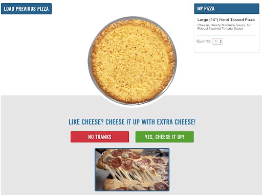
Not only do they use contrasting colors, but they also have visuals and make their form interactive to better engage you.
Microcopy
Add that little bit of extra copy to help encourage someone to act, reassure them that they are making the right choice by addressing concerns, or simply just clarify what’s next.
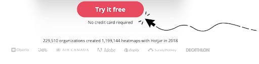
Take Hotjar for example. They do say clearly that you can try their product for free, but we’ve all been tricked by that before, haven’t we? Often you can sign up for a free trial, but you still have to enter your credit card information. Well, Hotjar addresses this concern with the additional microcopy: No credit card required. Simple. Effective.
Add social proof
If you want to encourage more people to fill out your form, add social proof to it. This can be either how many customers have used your service, places you’ve been featured, or positive reviews you’ve received.

Get rid of CAPTCHA
Hear us out on this one. Of course, filtering out spam is important for any site, but you don’t want to put that job on your user’s shoulders. When you have a CAPTCHA, you interrupt the form fill process and require an extra step that could lead to the endless frustration of trying to type in the right code, eventually giving up and leaving. We’ve all been there at least once.
In fact, there have been several studies on CAPTCHA’s effect when it comes to form fills, and many sites experienced a three percent decrease in conversions due to this. You have other options when it comes to security and filtering out those spam form fills.
Above the fold
User engagement is at its highest point above the fold. This is why you’ll often see websites include their most important information in that section, whether it be CTA’s, forms, etc. If you want to get the most exposure to your form, you’ll want it above the fold.
Remove distractions
If your goal is to have a user fill out your form, you’ll want to minimize friction, aka the distractions on the page. The more distractions there are, the less likely someone is to notice your form and fill it out. Take the below website for example. There is so much clutter, friction, and frankly just too much to look at. The form doesn’t stand out, and a user has too many options on this page as to where they can be directed to next. If you want users to fill out your form, make that the clear focus on the page and eliminate all other distractions.

One Last Thing
Our final piece of advice, although honestly, we could go on, will be to test your form. Oh yes, this is a common theme you’ll hear us repeat and we’ll continue to repeat it until the end of time. Not every bit of advice we give will work for you and your unique situation, so test different elements and see what gives you the ideal results. Once you achieve those results, keep testing and tweaking. You never know if you can do better if you don’t try.