
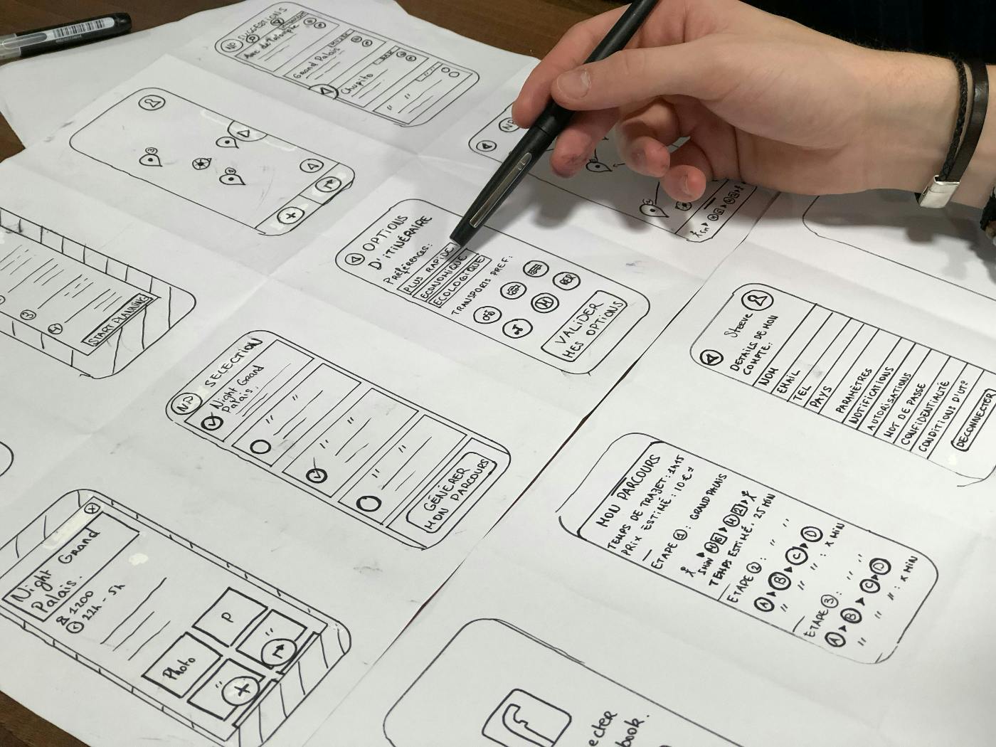
In the modern digital landscape, where an array of devices with varying screen sizes and capabilities have become ubiquitous, responsive web design has emerged as a crucial strategy for delivering a seamless and consistent user experience across different devices.
In the modern digital landscape, where an array of devices with varying screen sizes and capabilities have become ubiquitous, responsive web design has emerged as a crucial strategy for delivering a seamless and consistent user experience across different devices. The concept of responsive web design revolves around the idea that a website should adapt and respond to the user's environment, providing an optimal viewing and interaction experience regardless of whether the user is accessing the site on a desktop computer, tablet, smartphone, or any other device.
The Need for Responsive Web Design
Gone are the days when designing a single website layout for a standard desktop screen was sufficient. With the explosion of mobile devices, such as smartphones and tablets, accessing the internet has become a diverse experience. Users now expect websites to function and look appealing on any device they choose, and failure to meet these expectations can lead to high bounce rates and lost opportunities.
Enter responsive web design. The core principle behind this approach is flexibility. Rather than creating separate websites for each device type, responsive design focuses on crafting a single website that can adapt its layout, content, and design elements based on the device's screen size and orientation. This not only enhances user experience but also simplifies maintenance, as changes need to be implemented only once for all devices.
Key Components of Responsive Web Design
Fluid Grids: Traditional fixed-width layouts can look disproportionate on smaller screens. Responsive design employs fluid grids, which are based on proportional units like percentages rather than fixed pixels. This allows page elements to resize and reposition themselves dynamically as the screen size changes.
Flexible Images and Media: Images and multimedia content, like videos and infographics, need to be adaptable too. Using CSS rules, responsive design ensures that these assets can scale down or up as required, preventing cropping or distortion.
Media Queries: Media queries are the heart of responsive design. They allow developers to apply specific styles based on a device's characteristics, such as screen width, height, or orientation. This means a website can have different layouts for large desktop screens, tablets, and smartphones, each tailored for optimal user experience.
Breakpoints: Breakpoints are the points at which a website's layout changes to accommodate different screen sizes. Designers choose these points strategically to ensure that the layout transitions gracefully between different devices, maintaining usability and aesthetic appeal.
Mobile-First Approach: One popular strategy in responsive design is the mobile-first approach. Designers create the mobile layout first and then progressively enhance it for larger screens. This approach forces prioritization of essential content and helps in creating a streamlined experience across devices.
Typography Optimization: Fonts play a significant role in user experience. Responsive design adjusts font sizes and styles for different screens to ensure readability and aesthetic coherence.

Benefits of Responsive Web Design
Improved User Experience: Users can access a website from various devices without a hitch, encountering consistent branding and design elements regardless of screen size. This leads to longer engagement and reduced bounce rates.
Better SEO: Google and other search engines prefer responsive websites because they provide a consistent URL for all devices. This eliminates the need for duplicate content and ensures that all SEO efforts are concentrated on a single website.
Cost and Time Efficiency: Designing and maintaining a single responsive website is more efficient than creating multiple versions for different devices. It reduces development time, testing efforts, and overall costs.
Future-Proofing: As new devices with unique screen sizes and resolutions emerge, a responsive design approach makes a website inherently adaptable to these changes. This future-proofs the website to a certain extent.
Challenges and Considerations
While responsive web design offers a multitude of benefits, it's not without challenges:
Complexity: Implementing responsive design can be more complex than traditional approaches. Developers need a solid understanding of CSS, media queries, and design principles to create effective responsive layouts.
Performance: Loading assets meant for larger screens on small devices can slow down the website. Performance optimization becomes crucial to ensure fast loading times across devices and varying network conditions.
Testing: Responsive design requires rigorous testing on different devices and browsers to ensure consistent functionality and appearance. This testing phase can be time-consuming but is essential for a flawless user experience.
Design Compromises: Adapting the same design to various screen sizes may require compromises. Some design elements that work well on larger screens might need to be simplified or rearranged on smaller screens.
The Future of Responsive Design
As technology continues to evolve, the concept of responsive web design will likely remain relevant. However, the focus may shift to more advanced techniques and tools that enable even more tailored and dynamic user experiences. The rise of wearable devices, smart TVs, and other non-traditional browsing mediums will demand new strategies to cater to these platforms effectively.

Summing Up
Responsive web design is a vital approach for adapting to the multi-device reality that defines our digital age. By crafting websites that can seamlessly transform across various screen sizes and orientations, businesses and designers can ensure that users receive optimal experiences regardless of the devices they use. As the diversity of devices continues to grow, mastering responsive design principles will be essential for staying ahead in the competitive online landscape.
In this dynamic landscape of modern digital technology, responsive web design has emerged as a fundamental strategy for crafting websites that seamlessly adapt to the diverse array of devices users employ. This approach, built upon fluid grids, flexible media, and intelligent media queries, ensures that websites provide an optimal user experience across varying screen sizes and orientations. By prioritizing user satisfaction through consistent branding, improved SEO, and efficient development, responsive design addresses the challenges posed by the multi-device reality. While it demands technical expertise and meticulous testing, responsive design remains essential for delivering engaging and accessible online experiences in a world where devices continue to evolve.
You Should Know
ThoughtLab is a dynamic and innovative full-service creative agency renowned for its exceptional branding prowess and relentless commitment to thinking outside the box. With a team of visionary creatives, strategists, Web3, and marketing experts, plus decades of superior website design, ThoughtLab consistently delivers groundbreaking solutions that redefine the boundaries of branding and design. They understand that in today's fast-paced and competitive landscape, it is vital to break away from convention and embrace bold, unique ideas.
ThoughtLab's approach revolves around immersing themselves in their client's businesses, understanding their values and aspirations, and crafting tailor-made branding experiences that resonate deeply with the target audience. Their track record of success stands as a testament to their ability to push creative boundaries, captivate audiences, and ensure their client's brands stand out amidst the noise. With a focus on innovation and a passion for excellence, ThoughtLab continues to be at the forefront of revolutionizing the world of branding and marketing. Contact ThoughtLab today.